Location: Wayne, PA
Wayne is a historic community on the Main Line and is considered one of the best places in America to raise a family. Our clients, a family with young children, had bought a beautiful, historic, colonial-style stone house and were looking to expand the bedrooms and kitchen, and incorporate their very modern aesthetic.
The Vision
The family wanted a more open floor plan to connect the new kitchen to their beautiful living room. With a contemporary aesthetic, the desire was to combine that with the classic colonial style of the existing structure.
They wanted it to feel as minimalistic as it could get. Even in some of the older parts of the home that we were working on, they wanted us to alter moldings and remove details, to create clean edges.

Seamless was the word they used, which at first seemed impossible. One might think you can’t combine two dissimilar styles and have it look seamless, but in reality, if the transitions are well placed and blended with similar color palettes, a seamlessness can actually exist.

The Challenge
In a way, the vision itself was the challenge. Integrating the modern design and it’s wide-open space inside with the colonial features of the home was not something that was intuitively obvious.
Initially, they were looking for a set of sliding doors that could connect or separate the kitchen, the dining room, and the living room. This feature was eliminated as the design progressed because was a bit too expensive for the budget.
Another challenge was creating a seamless ceiling line from the new kitchen into the rest of the home. We had to remove an existing wall and support all the stone above it with a steel beam flush within the ceiling plane. Lining everything up like this can be challenging in an old home.
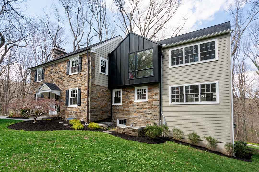
It wasn’t easy to bring all these different elements together, but it really works. The older part of the house has stone, horizontal siding, and copper gutters; all very traditional. The addition has black metal gutters and black metal vertical siding. The added bays project from the building about two feet. In the back, it looks even more dramatic when you’re standing down the hill looking up at it.
Probably the biggest challenge of this job was that the site itself. The home is on a steep hill on a very busy road. The driveway, is a short little driveway with hardly any space to park trucks and equipment during construction.
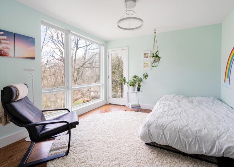
The steepness of the hills made bringing raising those huge windows really difficult. As well as setting up scaffolding to complete the exterior finishes.
The Details: Kitchen Design
The layout and the cabinetry materials are very unique . You walk through the galley style kitchen from the colonial dining room into the contemporary informal breakfast area filled with natural light. From the breakfast area, doors to the deck make the transition to the outdoors an easy one for entertaining in the warmer seasons.
On one side of the kitchen are tall cabinets with bold wood grain and color variations. A strong vertical orientation to the material adds a feeling of height to the cabinet run. The stainless appliances against the wood tones are just part of the juxtaposition of old and new that the homeowners desired. Opposite the tall wood pantries are the lower cabinets in blue and white quartz countertops with a waterfall edge at the end of the run.
The wide plank oak floors carried from the old part of the house through the new part helps smooth the transition of classic to modern and creates a blending of styles that helps it become more homogeneous in a way.
Final Remarks
In the end, if you’re facing the house from the front, you’ve got a charming, two-story stone house, and then to the right, and in the back where it drops down the hill, we put on a three-level addition and connected it into the existing first-floor section.

There was an existing two-story addition that had been built at some point in the past. We removed the second floor of it and kept the lower portion which we built on top of creating a contemporary element.

We would complete the project with a big deck off the back, looking out over the beautiful valley to the rear of the home. In the end, it turned out beautifully and the clients were thrilled!

Final Remarks
In the end, if you’re facing the house from the front, you’ve got a charming, two-story stone house, and then to the right, and in the back where it drops down the hill, we put on a three-level addition and connected it into the existing first-floor section.
There was an existing two-story addition that had been built at some point in the past. We removed the second floor of it and kept the lower portion which we built on top of creating a contemporary element.
We would complete the project with a big deck off the back, looking out over the beautiful valley to the rear of the home. In the end, it turned out beautifully and the clients were thrilled!


